This was another project that I had made for SVGCuts - so I'll show them to you now! But, just to make it more fun, and to lengthen the excitement - I'm only going to show you one at a time!
This part is what I had written intended for SVGCuts blog:
I admire the look of having your memorable pictures laid out artistically on a page, surrounded by beautiful embellishments. Unfortunately, I don't do much scrapbooking, but this time, I challenged myself to work "outside" my comfort zone, and created layouts for 3 special occasions: baby, wedding and birthday. I also tried to create these pages in different styles: shabby chic, elegant, and contemporary modern, respectively.
So.... today, I'm going to show you the baby layout! Here it is!
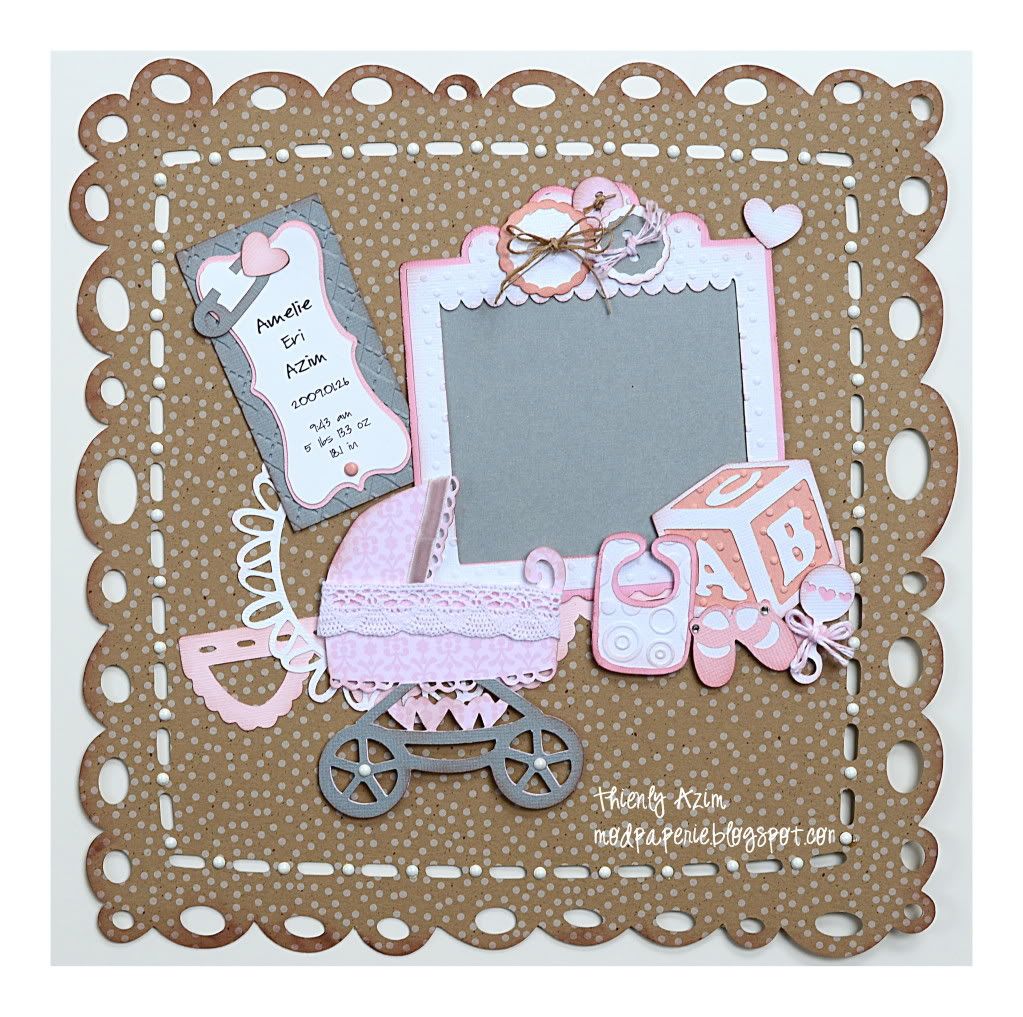
Sorry, there's no pic :) I need to find that perfect picture.....
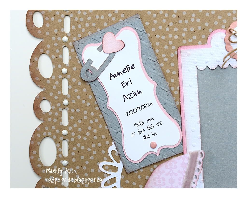
This is actually my daughter's info <3
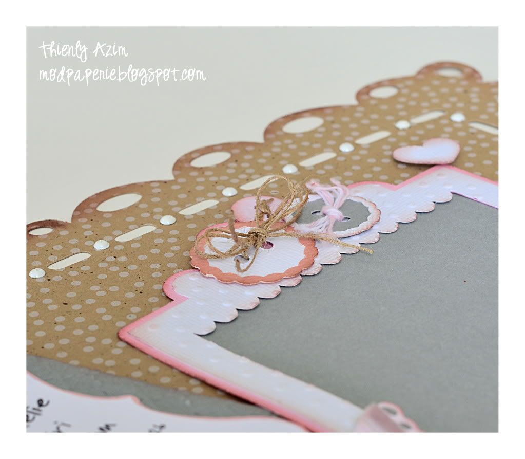
The paper buttons were tied with jute twine and pink twine.
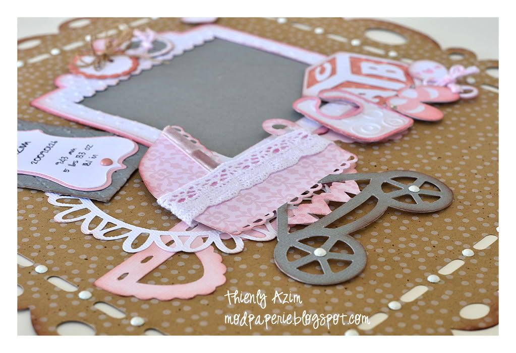
I love the doily and the paper lace behind all the elements - I find that they add so much to the layout!
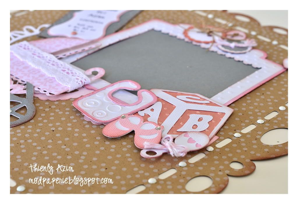
The white rounded circles around the border is from i-rock. I love that stuff!
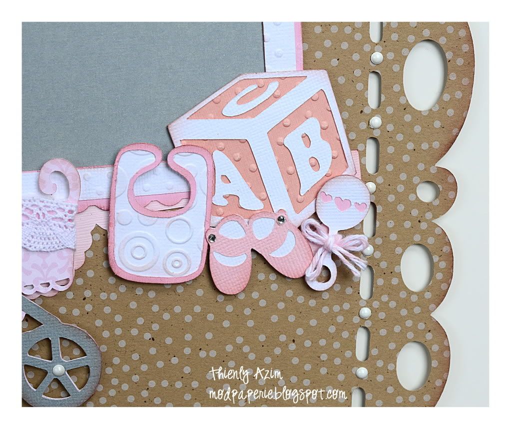
SVG Collections Used:
1. Little Sweet Peas SVG Collection
2. Edisto Islands Cards SVG Kit
3. Candy Cherub Bears SVG Collection
4. Dawn's Doilies SVG Collection
Again, if you are really interested in making the same page, just leave a comment here with your e-mail, and I'll send the Excel file with the SVG file info right over to you!
Design Tips:
- To achieve the simpleness of the page, limit yourself to using a few colors. Here, I chose white, various pinks, grey and kraft brown.
- Adding twine and lace textures add to the softness of the baby.
- Inking the edges will also give softness to the page.
- Doilies are pretty and perfect as space filler.
- Heart from Nora's frame was cut, but covered with buttons. The heart was used as a separate embellishment on the page.
- You do not need to fill the page. Cut all your elements first, and lay out on the page to make sure it balances before adhering them down.
- Embossing folders used: Cuttlebug Swiss Dots, Spots and Dots, and Argyle.
- Birth info was printed out on the computer and cut with Cricut.
That's it for today!
Hope that you have a GREAT weekend :)

So adorable...love the interplay of different textures! Looking forward to the wedding scrapbook layout. :-)
ReplyDeleteAdorable, as always... :-D
ReplyDeleteThis comment has been removed by a blog administrator.
ReplyDeleteThis is so cute!!! could you please send me the files @ jm23chick@aol.com thank you
ReplyDeleteThis comment has been removed by a blog administrator.
ReplyDeleteThis comment has been removed by a blog administrator.
ReplyDeletethis is so cute. can you send me the file jhuanahale24@gmail.com
ReplyDelete